
P-Image-Ideogram Guide: Examples, Pricing, and API
P-Image-Ideogram guide: 23 real test generations, the prompt_upsampling gotcha that breaks text, full pricing from $0.00375, and working API code.

I spent an afternoon and about 35 cents putting P-Image-Ideogram through 23 generations, and I came away with one finding I did not expect: the default settings are not the ones you want if you care about text.
That matters, because text is the entire reason this model exists. Pruna's P-Image-Ideogram is a text-to-image model built to render legible words inside the picture: menu boards, product labels, poster titles, thumbnail overlays, badge copy. Most image models still turn a four line price list into abstract squiggles. This one mostly does not, and it costs less than two cents a call at its most expensive setting.
Below is what I actually ran, what came back, what broke, and the exact parameters I would use in production. Every image in this post came out of the API during that session, and every price comes from the model's published rate table.
What P-Image-Ideogram is
P-Image-Ideogram is a text-to-image model from Pruna, served on Segmind as a synchronous endpoint at https://api.segmind.com/v1/p-image-ideogram. You POST a JSON body, you get image bytes straight back in the response. There is no job ID, no polling, no webhook. For anyone who has built a queue around an async image API, that alone removes a layer of plumbing.
The distinguishing parameter is thinking, which takes four values: very low, low, medium, and high. It is a compute dial. Turning it up costs more and buys you cleaner letterforms. The published average cost is $0.01875 per call, and the full range runs from $0.00375 to $0.0375 depending on where you set thinking and whether you ask for 1K or 2K.
Pruna also ships a plainer sibling, P-Image, at a flat $0.0050 per generation. That one has no thinking parameter and no text specialisation. If your prompt has no words in it, the sibling is the cheaper pick. If it does, keep reading.
The finding: prompt_upsampling is on by default, and it rewrites your text
The parameter that changed my results most was not thinking. It was prompt_upsampling, a boolean that defaults to true.
Prompt upsampling means the service expands your prompt into a richer one before generating. For a vague, vibes-driven prompt that is a genuine upgrade. For a prompt containing exact strings you need rendered character for character, it is a liability: the rewrite paraphrases your copy, and the model renders the paraphrase.
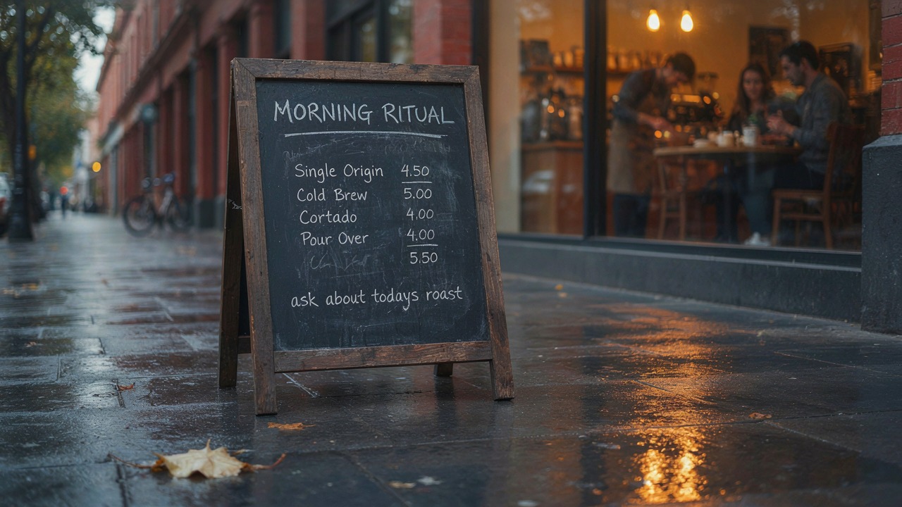
I ran the same chalkboard menu prompt at the same seed and the same thinking: high, flipping only that one flag.
Parameters thinking: high | image_size: 1K | aspect_ratio: 16:9 | seed: 7788 | prompt_upsampling: true vs false
prompt_upsampling: true (default)
prompt_upsampling: false
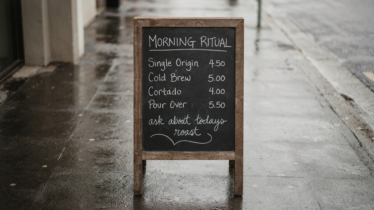
Same prompt, same seed, same thinking level. Only prompt_upsampling differs.
On the left, with the default in place, Pour Over is priced 4.00 instead of 5.50 and a fifth row appears that I never asked for, carrying the missing 5.50. On the right, with upsampling off, all four rows are correct and the closing line reads exactly as written.
There is a second effect worth knowing. With upsampling on, a fixed seed does not hold: the same seed at four different thinking levels gave me four completely different streets, framings, and times of day. With upsampling off, the seed behaves like a seed. Composition locks, and thinking becomes a clean quality dial instead of a reroll button. That is the difference between an art-directed asset pipeline and a slot machine.
What the thinking dial actually buys you
With prompt_upsampling off and the seed pinned, I walked the same prompt up the ladder. This is the comparison I would have wanted before I started.
Parameters image_size: 1K | aspect_ratio: 16:9 | seed: 7788 | prompt_upsampling: false | thinking: very low / low / medium
very low · $0.00375
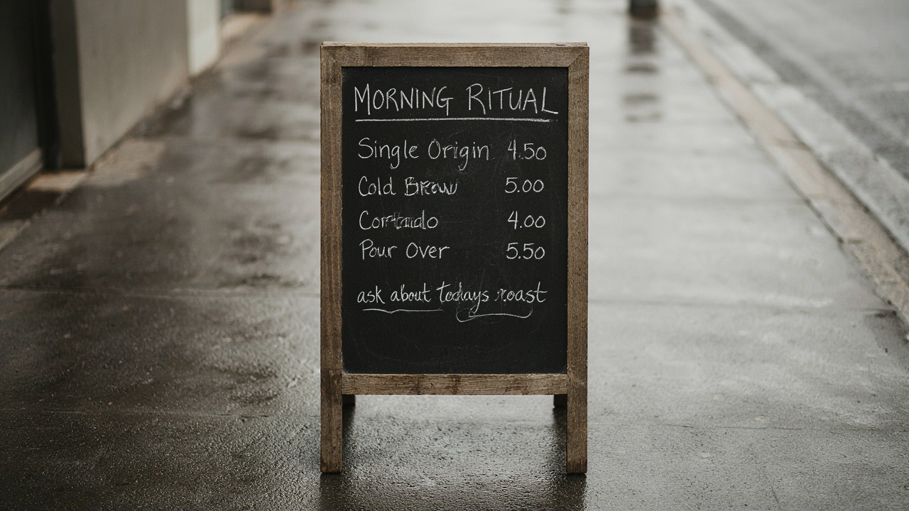
low · $0.009375
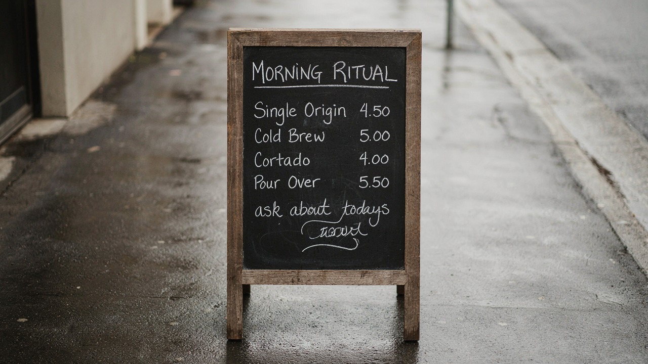
medium · $0.0125
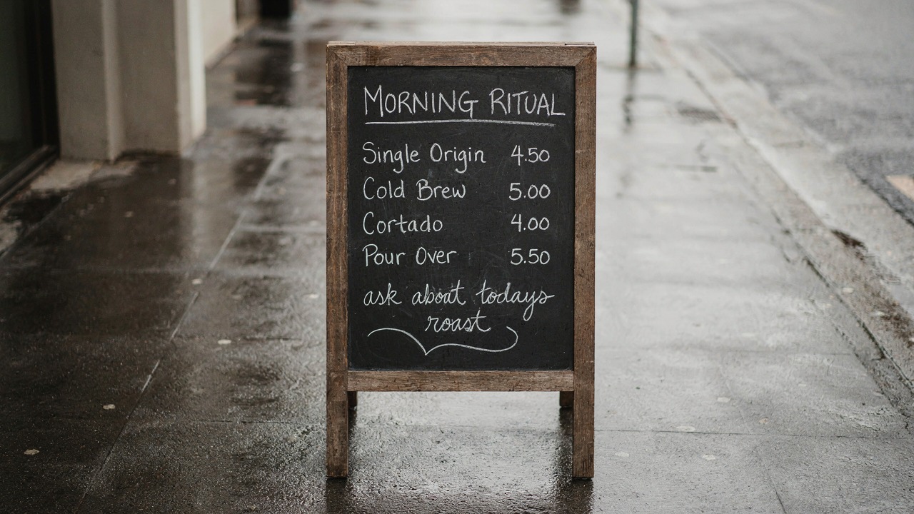
Composition is identical across all three because the seed holds once upsampling is off. Only the lettering changes.
At very low the scene is already right and the prices are readable, but the letterforms wobble: Cortado picks up an extra stroke and the script line loses a character. At low it tightens. At medium every glyph lands. I generated high as well, and on this prompt it was not visibly better than medium.
One more data point on that: for a denser conference badge prompt, medium and high with upsampling off returned byte-identical files. Same checksum. The dial saturates, and past a certain point you are paying 50 percent more for the same pixels. My working rule is medium for anything with real copy in it, very low for drafts, and high only when medium has visibly failed.
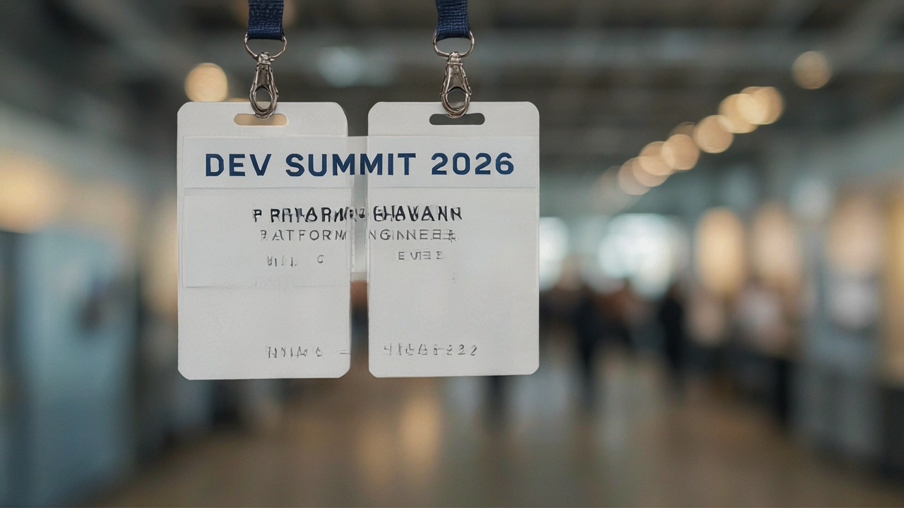
Where the dial does earn its money is text density. The chalkboard has one header and four short rows. A conference badge with a header, a name, a role, and a footer is a harder ask, and very low simply cannot hold it together.
Parameters image_size: 1K | aspect_ratio: 16:9 | seed: 60221 | thinking: very low vs medium
thinking: very low
thinking: medium
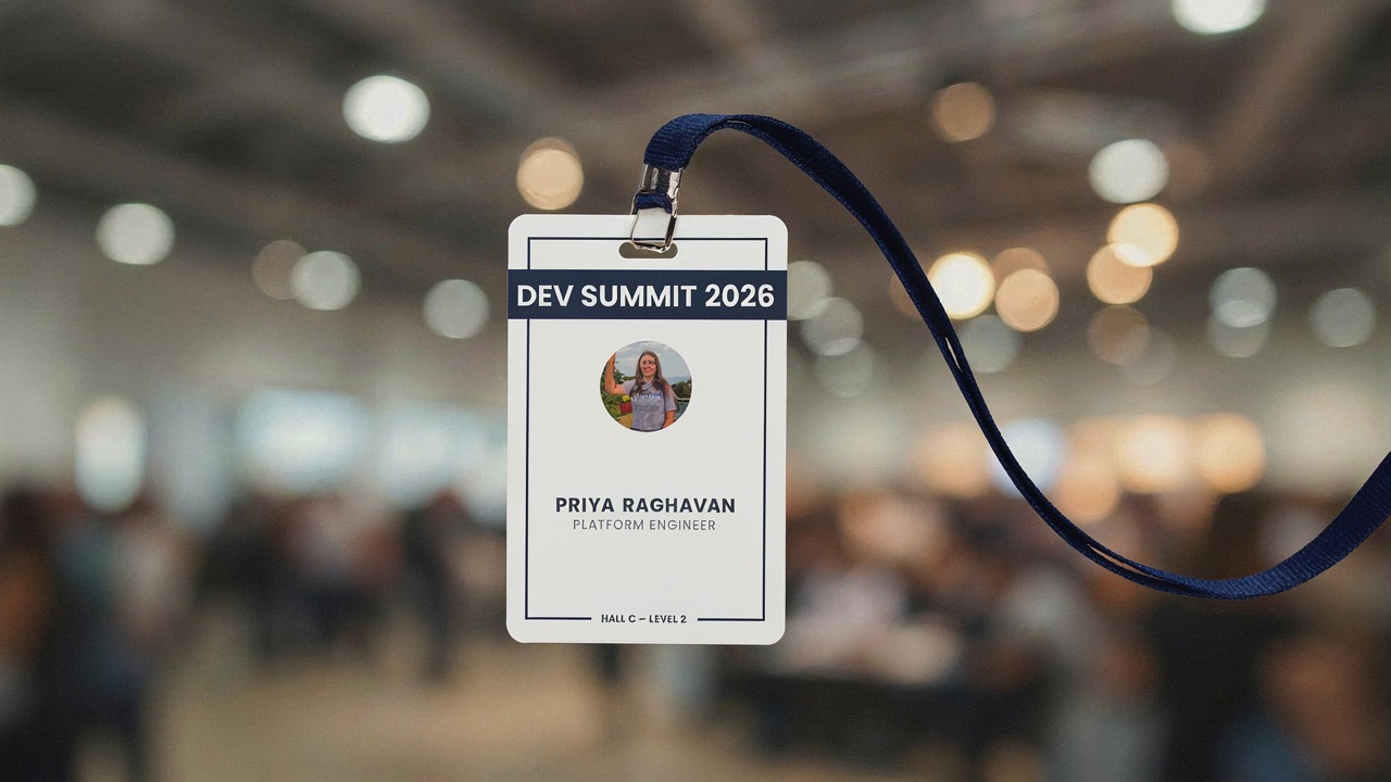
Four lines of copy on a small surface. Very low renders the header and abandons the rest.
Very low got the event name and then produced three lines of letter shaped texture underneath, on a duplicated badge. Medium rendered all four lines correctly. So the honest guidance is not that one setting is best, it is that the right setting scales with how much text you are asking the model to hold.
Use case 1: marketing agencies and product creative
The job I would actually hand this model is packaging and product creative where the label copy has to be right. An agency turning around 40 concept boards a week does not need a finished master file, it needs 40 plausible layouts with the client's real words on them.
Parameters thinking: high | image_size: 2K | aspect_ratio: 1:1 | seed: 4412
Product ad, 2K square
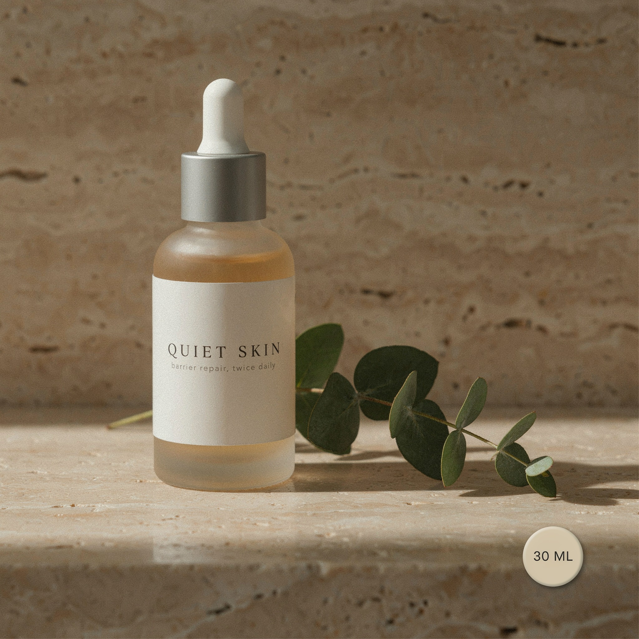
Defaults only, prompt and nothing else
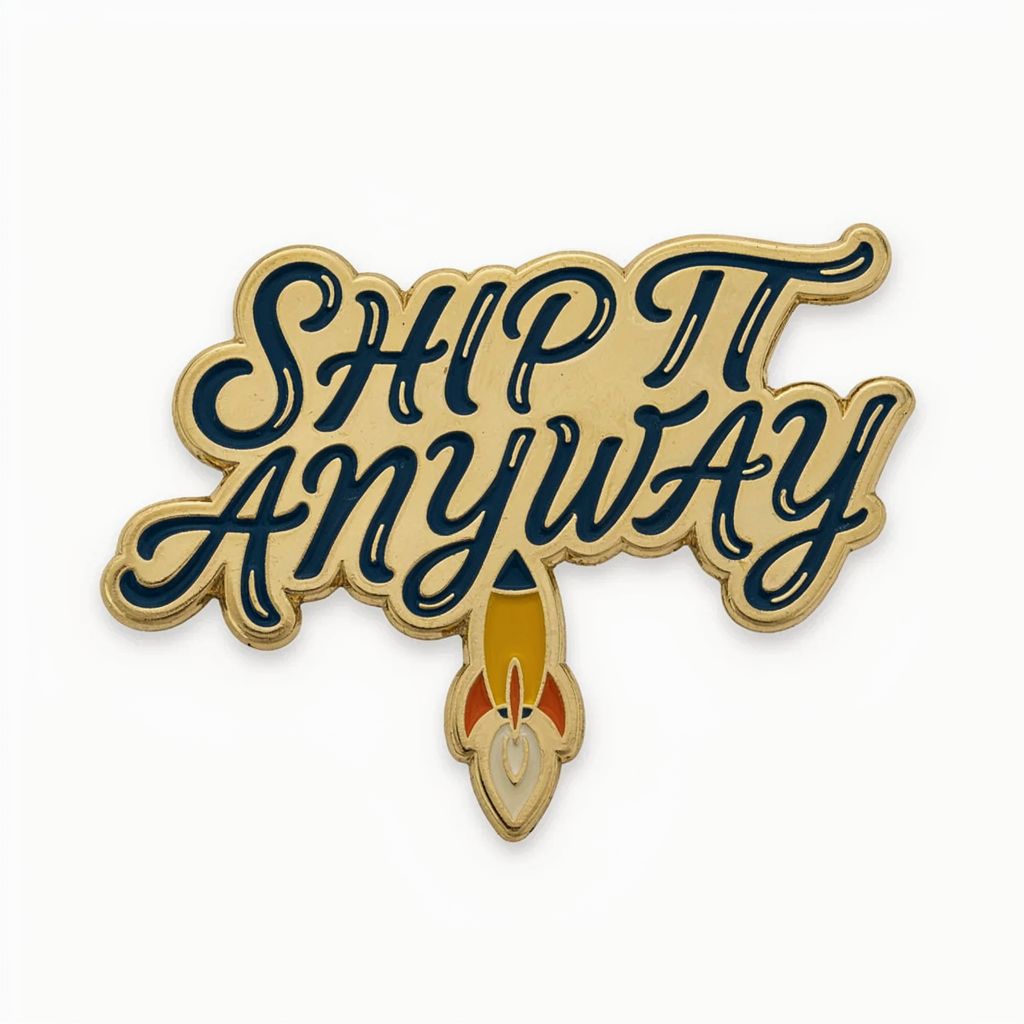
Left: three separate text elements at three sizes, all correct. Right: what you get sending only a prompt.
Three text elements at three different sizes, and all three landed: the serif headline, the lowercase strapline, and the small circular volume badge. Letter spacing on the headline is genuinely well set. At $0.0375 for a 2K square, a 40 board round costs a dollar fifty.
The image on the right is the developer minimum: prompt in, nothing else specified. Defaults give you thinking: high, 1K, and a 1:1 frame, which came back as 1024x1024. It is a reasonable place to start, but note that you are on the expensive rung of the dial by default with upsampling turned on, which is the worst combination for literal copy.
Use case 2: film studios and key art
For film, the useful test is a teaser poster, because posters are where typography either sells the thing or ruins it. I asked for a title, a tagline, and a credit block, which is the hardest ask on the page.
Parameters thinking: high | image_size: 2K | aspect_ratio: 2:3 | seed: 9031
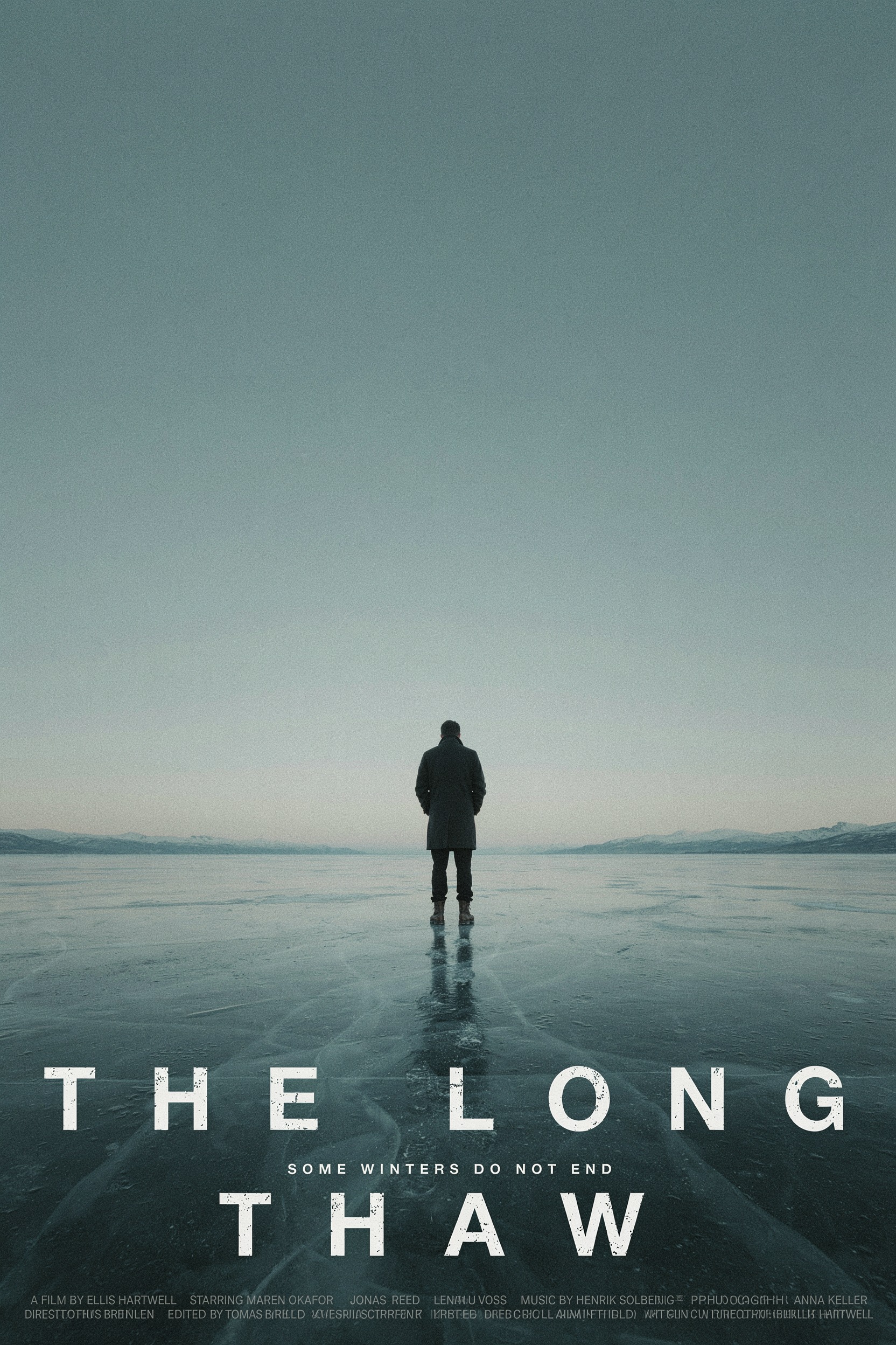
2K at 2:3 returns 1664x2496. Title and tagline are clean. The credit block is not.
The title and tagline are poster ready. The composition is better than I expected too: the figure is placed small and low against the sky, which is what you would actually brief a designer to do.
The credit block is where it falls apart, and it is worth being specific about that. The first line is largely readable, naming a director, a cast list, and a composer. The second line collapses into letter shaped noise. This is the clearest limit I found: P-Image-Ideogram holds text up to roughly a headline, a subhead, and a short supporting line, then degrades once type gets very small and very dense. Billing blocks and legal lines are still a compositing job, not a generation job.
Use case 3: production houses and MCNs
Thumbnails are a volume problem. A network running 500 uploads a month needs variants fast and cheap, and the text is the whole point of the frame.
Parameters thinking: high | image_size: 1K | aspect_ratio: 16:9 | seed: 2255
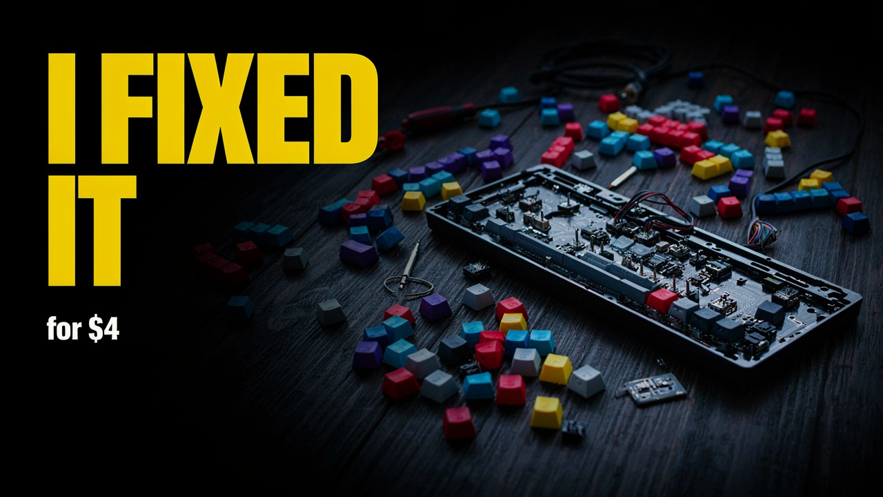
1K at 16:9 returns 1280x720, which is already a usable thumbnail resolution.
This came back usable as is. The headline is clean, the dollar figure rendered correctly, and the negative space on the left is where I asked for it. 1K at 16:9 gives you 1280x720, so there is no upscale step before upload.
At medium and 1K you are at $0.0125 a frame. Five variants per video across 500 videos a month is $31.25 in generation cost, which is the part that makes this interesting at network scale rather than as a novelty.
The model also handles a custom canvas, which is useful for site banners that are nowhere near a standard ratio. I asked for 2560x1080 and got 2560x1088 back, so it appears to round dimensions up to a multiple of 16. Worth knowing before you wire it into a layout that expects exact pixels.
aspect_ratio: custom with width 2560 and height 1080, thinking medium, PNG output.
Developer integration
The call is about as simple as an image API gets. Synchronous, binary response, no polling.
import requests

resp = requests.post(
    "https://api.segmind.com/v1/p-image-ideogram",
    headers={"x-api-key": "YOUR_API_KEY"},
    json={
        "prompt": 'A cafe chalkboard reading "MORNING RITUAL" above a short price list.',
        "thinking": "medium",         # very low | low | medium | high
        "image_size": "1K",           # 1K | 2K
        "aspect_ratio": "16:9",
        "prompt_upsampling": False,   # keep literal text literal
        "seed": 7788,
        "output_format": "jpg",
        "output_quality": 92,
    },
    timeout=120,
)
resp.raise_for_status()
open("out.jpg", "wb").write(resp.content)
Three parameters carry most of the weight. prompt_upsampling should be False whenever the prompt contains strings you need rendered verbatim, and left at the default when you are exploring and want the service to enrich a thin prompt. thinking is your cost and quality dial. seed only means something once upsampling is off, at which point it gives you reproducible composition and lets you iterate on wording without losing the frame.
On timing: every call in my session came back between 7 and 19 seconds end to end from my machine, and the upsampling-off calls were consistently the quickest at around 7 seconds. That is wall clock including queueing and transfer, not GPU time, so treat it as a rough planning number rather than a benchmark. All 23 calls returned HTTP 200 with no failures or retries. Full parameter reference is on the model page.
Pricing
Cost is set by two dimensions, thinking and image_size. These are the published rates.
| thinking | 1K | 2K |
|---|---|---|
| very low | $0.00375 | $0.0075 |
| low | $0.009375 | $0.01875 |
| medium | $0.0125 | $0.025 |
| high | $0.01875 | $0.0375 |
A dollar buys 266 images at very low and 1K, or 80 at medium and 1K, or 26 at high and 2K. My whole 23 generation session, including the deliberately expensive 2K poster and product runs, came to about 35 cents.
The cost optimisation that actually matters here is not picking a cheaper rung, it is not paying twice. Draft your composition at very low with a fixed seed and upsampling off, and once the frame is right, re-run the identical call at medium. Because the seed holds, you get the same picture with better lettering rather than a new picture you have to approve again.
Honest assessment
What it does well: short to medium text at display sizes, reliably, at a price that makes bulk generation a rounding error. Headlines, product labels, signage, thumbnail overlays, badges, and posters are all in range. The photoreal quality underneath the text is good enough that the text is the reason to pick it, not an excuse for the rest.
Where it falls short: dense small type degrades into noise, as the poster credit block showed, and that limit arrives sooner than you would like. The defaults are wrong for its own headline use case, which is a genuine trap for anyone who reads the model card and fires a call. And punctuation is approximate: in one badge render it substituted a longer dash for the plain hyphen I had written, which is fine for a mock and not fine for a legal line.
Best fit: high volume creative where words must be legible and roughly right. Not a fit: anything where the text is contractual, where small print must be exact, or where you need the same character-perfect string across hundreds of assets. For that, generate the plate here and composite the type yourself.
FAQ
What is P-Image-Ideogram used for?
Generating photoreal images that contain legible text: product labels, posters, signage, thumbnails, banners, and badges. It is a text-to-image model tuned for in-image typography rather than general illustration.
How do I use the P-Image-Ideogram API?
POST JSON to https://api.segmind.com/v1/p-image-ideogram with an x-api-key header. Only prompt is required. The response is image bytes directly, with no polling step.
How much does P-Image-Ideogram cost?
From $0.00375 per image at very low thinking and 1K, up to $0.0375 at high thinking and 2K. The published average is $0.01875 per call.
Why is the text in my P-Image-Ideogram output wrong?
Most likely prompt_upsampling, which defaults to true and paraphrases your prompt before generating. Set it to false whenever your prompt contains exact strings that must render verbatim.
Which thinking level should I use?
Medium for anything with real copy in it. Very low for drafts and composition tests. High only when medium has visibly failed, since on some prompts it returns identical output for 50 percent more cost.
What is the difference between P-Image-Ideogram and P-Image?
P-Image is a flat $0.0050 per generation with no thinking parameter and no text specialisation. Pick it for prompts with no words in them, and P-Image-Ideogram when the image has to carry copy.
Wrapping up
P-Image-Ideogram earns its niche. It renders display text properly, it is cheap enough to run at volume, and the synchronous endpoint keeps the integration to about ten lines. The catch is that you have to override two defaults to get its best behaviour: turn prompt_upsampling off and drop thinking from high to medium. Do that and you get reproducible, correctly lettered images for just over a cent each.
You can try it on the P-Image-Ideogram model page, no setup required.