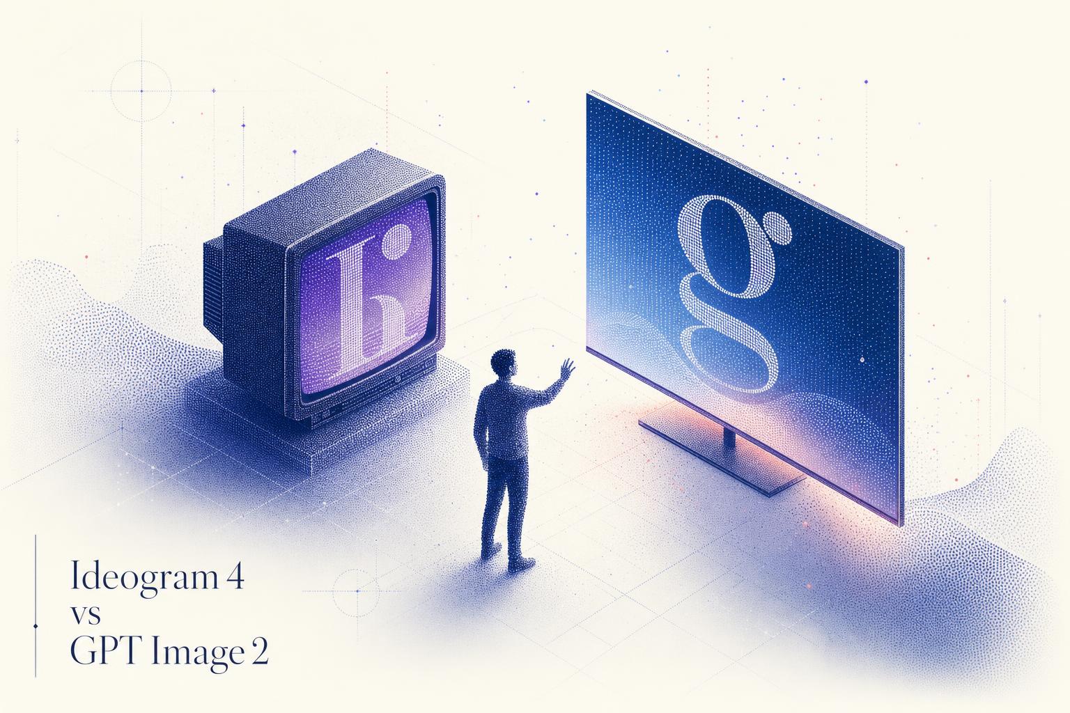
Ideogram 4 vs GPT Image 2: A Design and Text Showdown
I put Ideogram 4 and GPT Image 2 through six identical design prompts, from posters to multilingual signage. Here is who won each round.

Ideogram shipped version 4 on June 4, and the headline claim is a big one: the best text rendering of any open weight image model, built specifically for design work like posters, packaging, logos and signage. As someone who runs an image generation API for a living, that claim got my attention, because the model most people reach for today when they need legible text inside an image is GPT Image 2, OpenAI's closed model on the GPT-5.4 backbone.
So I did the obvious thing. I put both on the same bench, gave them six identical prompts across the jobs teams actually pay to automate, and looked at what came back. Same prompt to each model, same quality settings, no cherry picking. This is a fair head to head, and I called wins and losses round by round. Here is what I found.
The two contenders
Ideogram 4 is a 9.3B parameter diffusion transformer released as Ideogram's first open weight frontier model. Its pitch is design: production grade typography with multilingual support, native 2K output, and explicit layout control through bounding boxes, color palettes and a structured JSON prompt interface. On Ideogram's own blind designer benchmark it ranks second overall and first among open weight models. Because the weights are open, you can download it, audit it, fine tune it on your brand and run it on your own infrastructure.
GPT Image 2 is OpenAI's closed flagship, released April 21 on the GPT-5.4 backbone. Its strengths are state of the art photorealism, near perfect text rendering, and very strong instruction following, including small text, icons and dense compositions. It reasons about a prompt before generating and can self check its own output. It is API only, with no weights to download.
How I tested
I ran every prompt through both models on Segmind using the same x-api-key. Ideogram 4 ran at QUALITY rendering speed with prompt expansion left on (the default), GPT Image 2 ran at high quality. I matched aspect ratios per round so nothing won on framing alone. One honest caveat up front: Ideogram's prompt expansion is on by default, and in one round it invented text I did not ask for. I left it on because that is what most people will use out of the box.
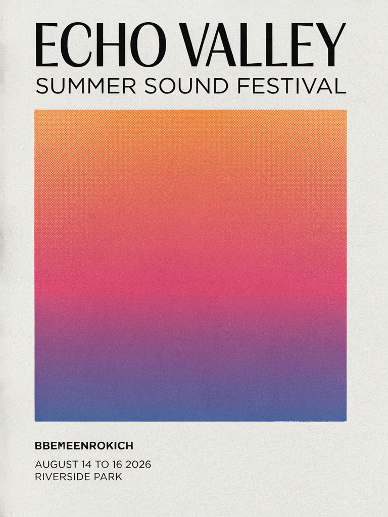
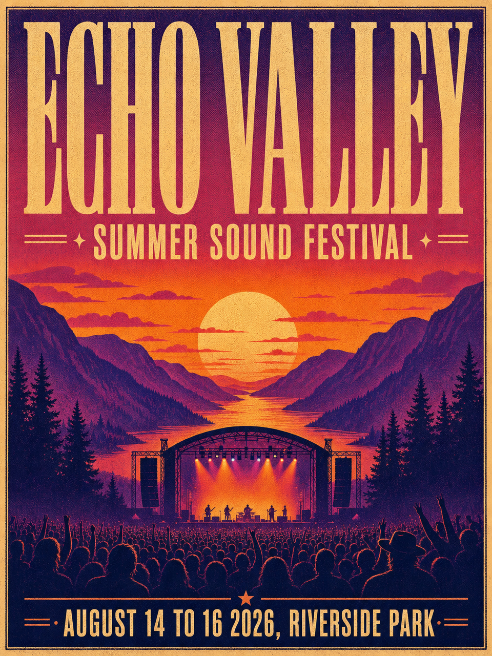
Round 1: Typography poster
Posters are the classic can your model do text test: a big headline, a subhead and a date line, all of which have to be spelled right and laid out with some taste.
Parameters Ideogram 4: image_size portrait_4_3 | rendering_speed QUALITY || GPT Image 2: size 960x1280 | quality high
Ideogram 4
GPT Image 2
Same poster brief, two very different reads of it.
Ideogram rendered the ECHO VALLEY headline and SUMMER SOUND FESTIVAL subhead crisply, but it left most of the canvas empty and slipped a garbled nonsense word into the lower left. That is the prompt expansion tax: it can invent type you never wrote. GPT Image 2 came back with a finished poster: the same headline locked up cleanly, plus an illustrated stage, a crowd and a mountain sunset, with the date line spelled correctly. For a one shot, ready to publish poster, GPT won this. Ideogram gives you cleaner type to build on, GPT gives you a finished artifact.
Round verdict GPT Image 2 on completeness. Ideogram's core type was sharp, but the empty layout and the stray word cost it.
Round 2: Logo and branding
Logos are where a single wrong letter is fatal, so this is pure text fidelity plus restraint.
Parameters Ideogram 4: image_size square_hd | rendering_speed QUALITY || GPT Image 2: size 1024x1024 | quality high
Ideogram 4
GPT Image 2
Both spelled it perfectly. The difference is taste.
Both nailed the wordmark and the tagline with zero spelling errors. Ideogram leaned minimal: a thin line art bean, airy spacing, the kind of restrained mark a brand designer would actually hand a client as a starting point. GPT went warmer and more conventional, stacking the wordmark over a decorative tagline rule. Both are usable today. If you want a clean, editable mark with room to breathe, Ideogram's discipline is the stronger base.
Round verdict Tie, with a slight nod to Ideogram for design restraint.
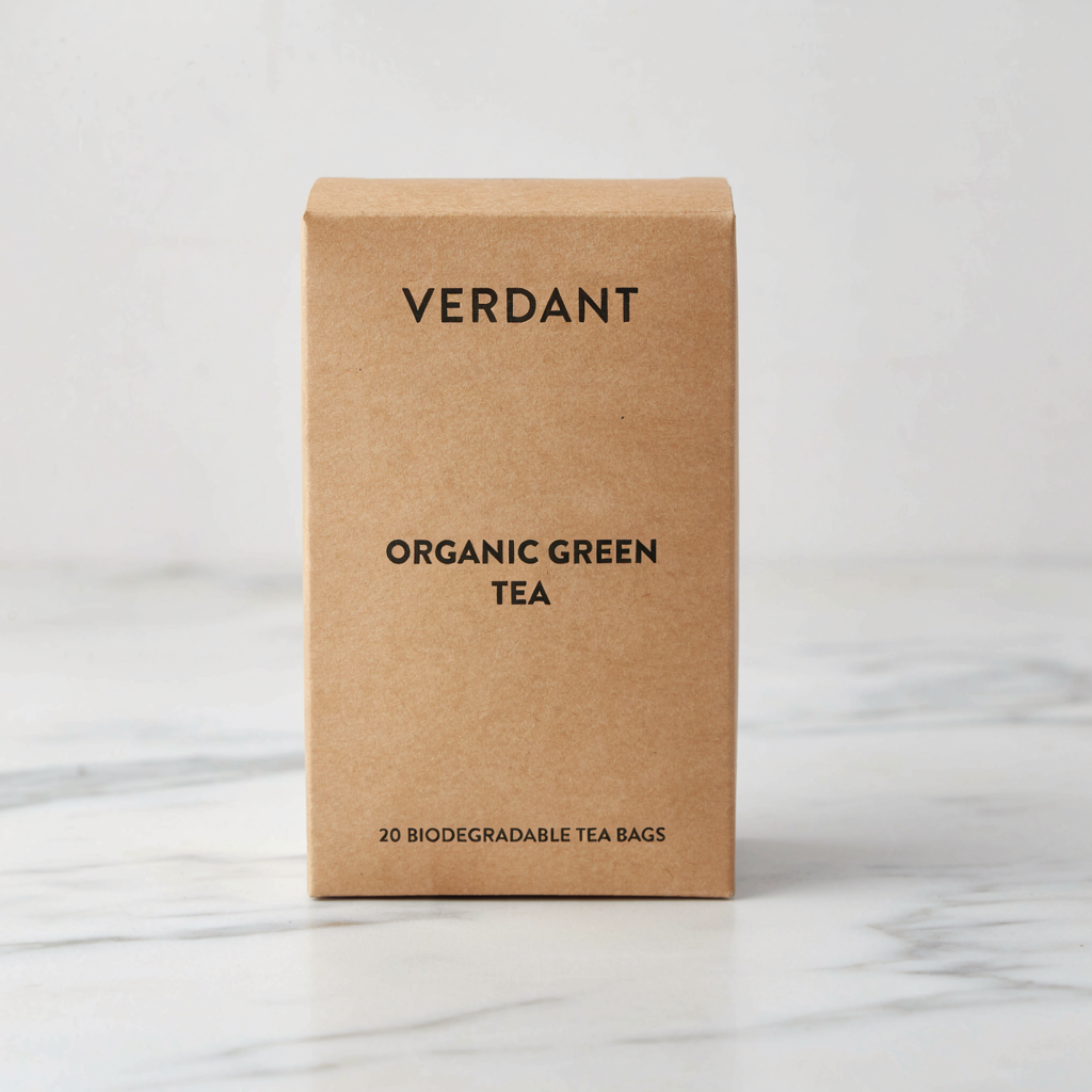
Round 3: Product packaging
Packaging is text on a real surface under real light, with the brand copy stacked in a hierarchy.
Parameters Ideogram 4: image_size square_hd | rendering_speed QUALITY || GPT Image 2: size 1024x1024 | quality high
Ideogram 4
GPT Image 2
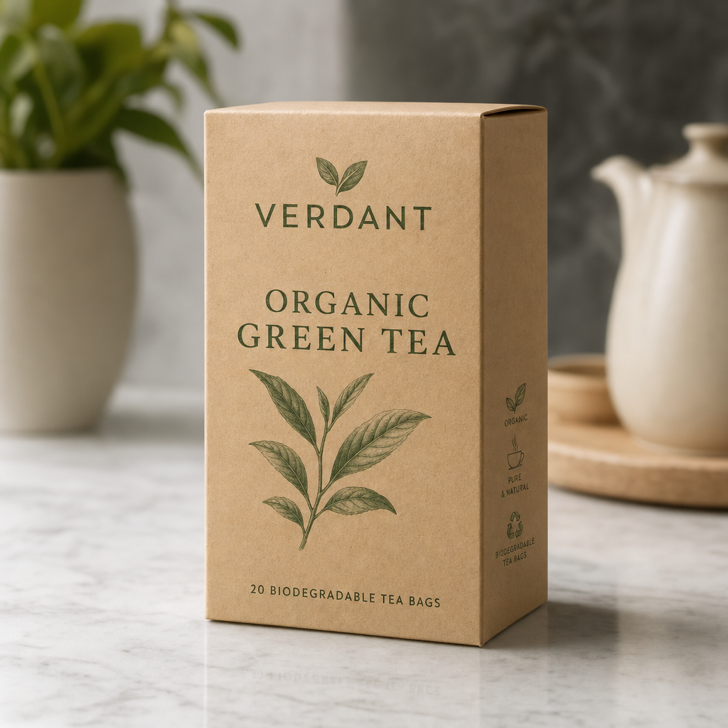
A clean dieline render versus a staged product shot.
Text was correct on both boxes, all three lines, no errors. Ideogram delivered a clean, minimal kraft box, the flat sort of mock you would build a dieline from. GPT staged a fuller scene: a botanical tea leaf illustration on the box itself, a teapot and a plant in soft focus behind it, and a green accent color pulling it together. GPT's reads like a finished product shot, Ideogram's reads like a tidy base render you would art direct later.
Round verdict GPT Image 2 for art direction. Ideogram for a cleaner base mock.
Round 4: Multilingual signage
Multilingual is Ideogram's explicit headline feature, so this was the round I most wanted to see. The brief mixes Japanese and English across several text zones.
Parameters Ideogram 4: image_size landscape_4_3 | rendering_speed QUALITY || GPT Image 2: size 1280x960 | quality high
Ideogram 4
GPT Image 2
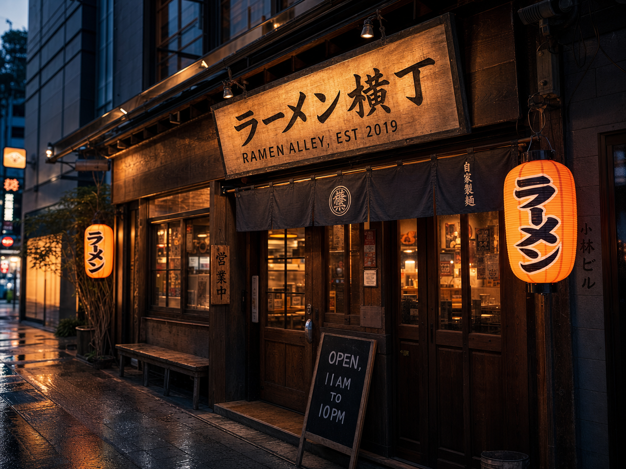
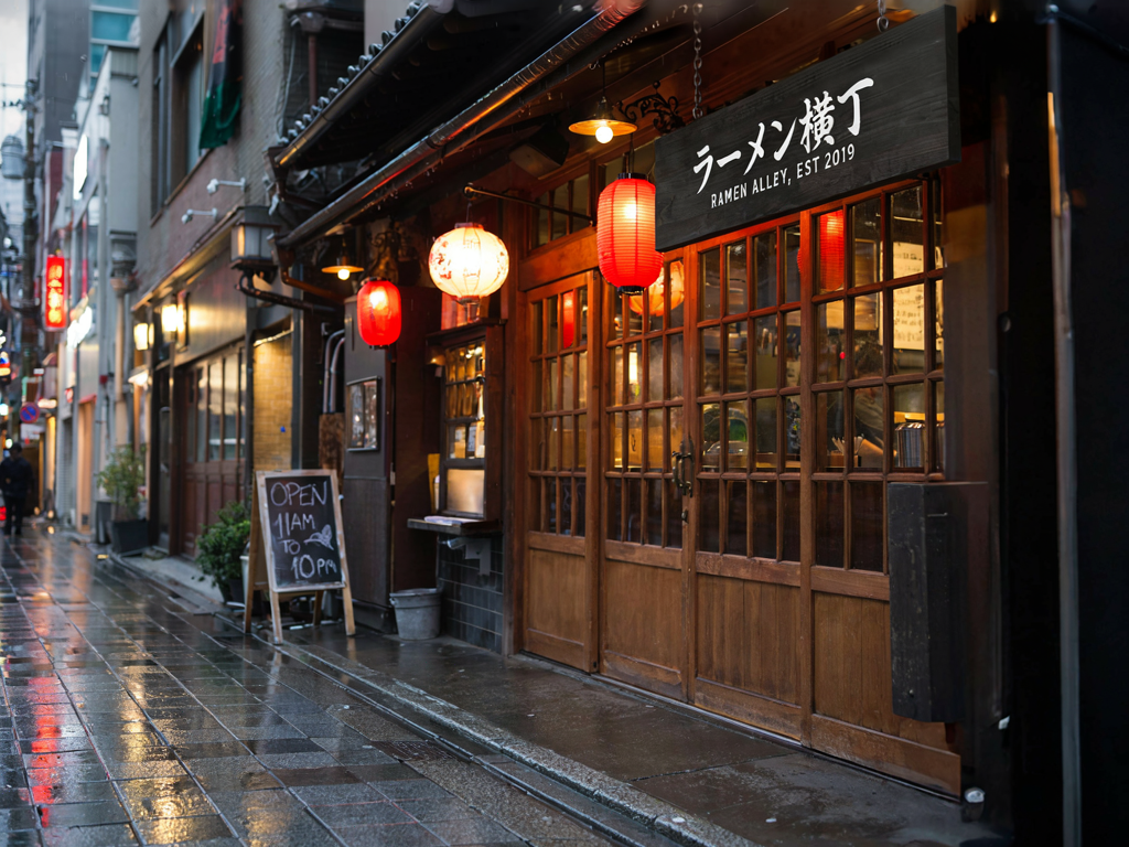
Both got the Japanese and English right. GPT carried more text zones.
Both rendered the Japanese ラーメン横丁 and the English RAMEN ALLEY, EST 2019 correctly, which is genuinely impressive on both sides and validates Ideogram's core multilingual claim. The separator was how many text zones each handled at once. GPT also rendered the chalkboard hours and the lantern text accurately and lit the whole scene more cinematically. Ideogram kept the main sign perfect but simplified the rest. Both pass the multilingual test outright. GPT just carried more correct text across the frame.
Round verdict GPT Image 2 on multi zone text, with Ideogram fully holding its own on the core multilingual claim.
Round 5: Social ad creative
Agencies live and die by ad variants, which means headline, subhead, a call to action and often a feature list, all on brand.
Parameters Ideogram 4: image_size square_hd | rendering_speed QUALITY || GPT Image 2: size 1024x1024 | quality high
Ideogram 4

GPT Image 2

A clean single message versus a full performance ad.
Ideogram produced a clean, single message ad: headline, subhead, button and a strong runner photo, everything spelled right. GPT produced something closer to a real performance ad: the same headline and subhead, plus a three item feature list with icons, an in app phone mockup with a legible step counter, a branded logo lockup and the CTA, all rendered without garbling. For a finished, conversion ready creative in a single generation, GPT was on another level here.
Round verdict GPT Image 2, clearly. Its dense, multi element layout came back clean.
Round 6: Photoreal portrait
This is the counterpoint round. Photoreal human faces are GPT Image 2's documented strength, so I wanted to see how close Ideogram could get.
Parameters Ideogram 4: image_size portrait_4_3 | rendering_speed QUALITY || GPT Image 2: size 960x1280 | quality high
Ideogram 4
GPT Image 2
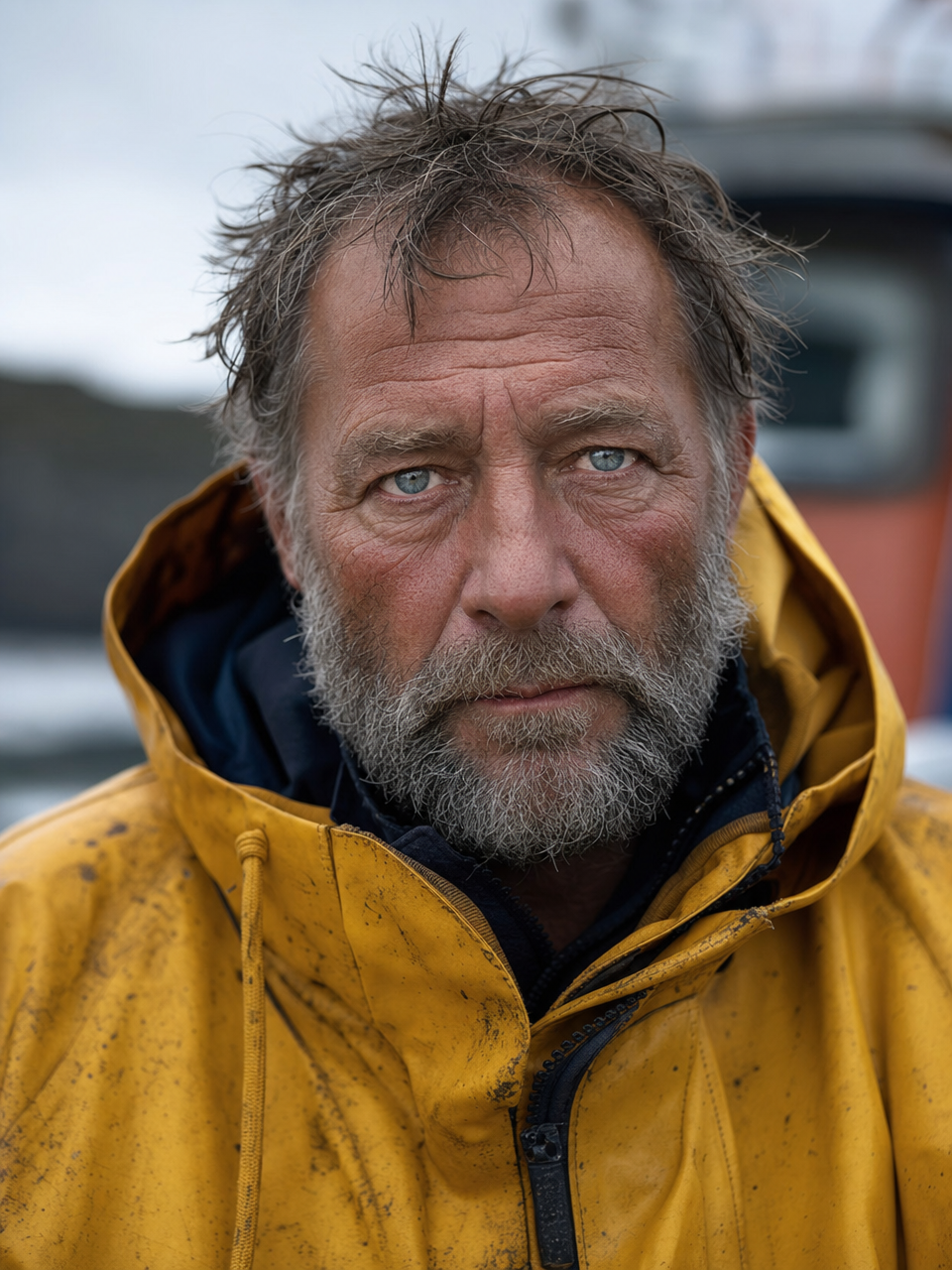
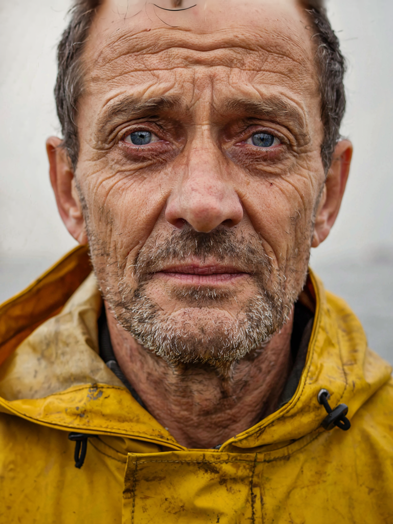
Both convincing. GPT had the photographic edge.
Both gave me a convincing weathered fisherman with the right blue eyes and yellow raincoat. GPT had the edge OpenAI is known for: fuller beard detail, more believable skin micro texture, a harbor backdrop with real depth of field, and a frame that reads as an actual photograph rather than a render. Ideogram's was good and tightly cropped, just a touch flatter. No surprise here, but worth confirming with my own eyes.
Round verdict GPT Image 2, as expected. Photoreal faces remain its home turf.
The scorecard
Across six rounds, GPT Image 2 produced the more finished single shot output more often, while Ideogram 4 matched it on the one thing it promised, reliable text, and pulled ahead on minimalism, control, openness and cost. Here is how I scored it.
| Round | Winner | Why |
|---|---|---|
| Typography poster | GPT Image 2 | Finished artifact; Ideogram left the layout empty and added a stray word. |
| Logo and branding | Tie (slight Ideogram) | Both perfect text; Ideogram more restrained and editable. |
| Product packaging | GPT Image 2 | Stronger art direction; Ideogram cleaner as a base mock. |
| Multilingual signage | GPT Image 2 | Both nailed JP + EN; GPT carried more correct text zones. |
| Social ad creative | GPT Image 2 | Clean dense layout with icons, UI mockup and branding. |
| Photoreal portrait | GPT Image 2 | More believable skin, depth and environment. |
| Openness, control, cost | Ideogram 4 | Open weights, self host and fine tune, layout controls, a 3 cent TURBO tier. |
Read that table carefully before you conclude GPT simply won. The rounds measured finished, one shot output, and GPT is excellent at that. But the bottom row is where a lot of real production decisions actually get made.
Pricing and openness: the part that changes the decision
On Segmind, Ideogram 4 is priced per megapixel by rendering speed: TURBO at 0.03, BALANCED at 0.06 and QUALITY at 0.10 per megapixel. A standard image lands around a dime at top quality and a few cents on TURBO. GPT Image 2 is billed on tokens (text input, image input, and output image tokens), which works out to roughly a dime for a typical high quality render but climbs with resolution and reference images.
The bigger structural difference is openness. Ideogram 4 ships open weights, so you can download it, audit it, fine tune it on your own brand assets and self host it behind your own VPC. GPT Image 2 is API only. If you generate at volume, or you need an on prem deployment or a fine tuned model, that openness plus the TURBO tier makes Ideogram the cheaper and more controllable path. If you want the single best hosted result with zero infrastructure, GPT's quality is hard to argue with.
Which one should you actually use
Reach for Ideogram 4 when you want clean, minimal, design system assets, accurate multilingual text, and fine grained layout control through its bounding box, color palette and JSON prompt features, and especially when cost at scale or self hosting matters. It is the better base layer for a design pipeline you intend to art direct further.
Reach for GPT Image 2 when you want a finished, art directed, photoreal creative in one generation, dense multi element layouts like feature lists and UI mockups, and top tier human photorealism, and you are comfortable being API only. In my tests GPT won more rounds on finished output, while Ideogram matched it on reliable text and beat it on openness and cost. Most teams I talk to will end up using both, Ideogram for clean, controllable, self hostable design assets and GPT for one shot polish.
Calling both from one API
Both models run on Segmind behind the same x-api-key, so you can A/B them with a two line change. Ideogram 4 returns a binary image directly:
import requests

resp = requests.post(
    "https://api.segmind.com/v1/ideogram-4",
    headers={"x-api-key": "YOUR_API_KEY"},
    json={
        "prompt": "A bold festival poster reading ECHO VALLEY ...",
        "image_size": "portrait_4_3",
        "rendering_speed": "QUALITY",   # TURBO | BALANCED | QUALITY
        "output_format": "png"
    }
)
open("ideogram.png", "wb").write(resp.content)
GPT Image 2 uses the same pattern. Note the output_compression value, which has to be 100 when you ask for PNG:
import requests

resp = requests.post(
    "https://api.segmind.com/v1/gpt-image-2",
    headers={"x-api-key": "YOUR_API_KEY"},
    json={
        "prompt": "A bold festival poster reading ECHO VALLEY ...",
        "size": "960x1280",
        "quality": "high",              # low | medium | high
        "output_format": "png",
        "output_compression": 100
    }
)
open("gptimage2.png", "wb").write(resp.content)
Full parameter references live on the model pages: Ideogram 4 and GPT Image 2.
FAQ
What is Ideogram 4 best at? Text rendering and design led layouts: posters, logos, packaging and signage, now with multilingual support, native 2K output and layout controls, all as an open weight model you can self host.
Is Ideogram 4 better than GPT Image 2? For clean design assets, multilingual text, layout control and cost at scale, Ideogram is excellent. For finished photoreal creative and dense layouts in a single generation, GPT Image 2 still edged ahead in my six round test.
Is Ideogram 4 open source? It ships with open weights, so you can download, fine tune and self host it. GPT Image 2 is API only with no weights to download.
How much does Ideogram 4 cost? On Segmind it is priced per megapixel: 0.03 at TURBO, 0.06 at BALANCED and 0.10 at QUALITY, so most images cost a few cents to about a dime.
Does GPT Image 2 render text well? Yes. It was near perfect on core copy and handled the densest multi text layouts best in my tests, including a feature list and an in app UI mockup.
Can I use both from one API? Yes. Both run on Segmind with the same x-api-key, so you can compare or switch between them with a single line change.
The bottom line
Ideogram 4 makes good on its core promise. Its text rendering is reliable, its multilingual output is accurate, and as an open weight model with layout controls and a 3 cent tier, it is the more controllable and cheaper option for design pipelines at scale. GPT Image 2 still produces the more finished, photoreal, one shot result, especially on dense layouts and human faces. The honest answer is that they are aimed at slightly different jobs, and the good news is you do not have to pick blindly. Try them side by side on Ideogram 4 and GPT Image 2, with the same prompt, and let your own use case decide.