Ideogram 4.0 vs Nano Banana Pro: Text Rendering Showdown
I ran Ideogram 4.0 against Nano Banana Pro on 5 real text tasks: posters, logos, signage, infographics, packaging. Here is where it stands.


When Ideogram 4.0 launched a few days ago, the headline claim was bold: the best text rendering of any image model, open weights included. As someone who looks at AI image output all day, I have learned to treat "best text rendering" claims with suspicion, because the bar moved a lot in the last year. Google's Nano Banana Pro now renders multilingual text and complex layouts that would have been impossible eighteen months ago. So I wanted to know where Ideogram 4.0 actually stands today, not on a benchmark chart, but on the exact jobs it claims to own: posters, logos, signage, infographics, and packaging.
To find out, I ran five real-world prompts head to head against Nano Banana Pro, the strongest closed model in this lane. Same prompt, same intent, judged on text accuracy and finished quality. Here is what I found.
What is Ideogram 4.0?
Ideogram 4.0 is a 9.3 billion parameter text-to-image model, and it is Ideogram's first open-weight release. Under the hood it is a single-stream Diffusion Transformer trained from scratch, paired with a vision-language text encoder and trained on structured captions that describe every element in an image. That architecture is the reason it is so good with words inside pictures: it learned text placement at a structural level instead of pattern matching it.
The practical specs matter for the use cases below. It generates at native 2K resolution, up to 2048 pixels per side, with flexible aspect ratios and no separate upscaling step. It supports color palette conditioning and bounding-box layout control, and it is built to handle dense compositions with many individual elements. On Segmind it runs through a simple API with three rendering modes, TURBO, BALANCED, and QUALITY. I ran every test on QUALITY. You can see the full parameter set on the Ideogram 4.0 model page.
How I ran the test
I kept the comparison as fair as I could. Each prompt went to both models unchanged, with the exact text I wanted rendered wrapped in quotes so I could grade spelling objectively. On Ideogram 4.0 I used QUALITY mode with prompt expansion turned off, so the model rendered my literal text rather than an LLM rewrite of it. On Nano Banana Pro I used 2K output. Both produce high-fidelity results in their top tier, so this is a quality-versus-quality test, not a speed or price race. Let us get into the five rounds.
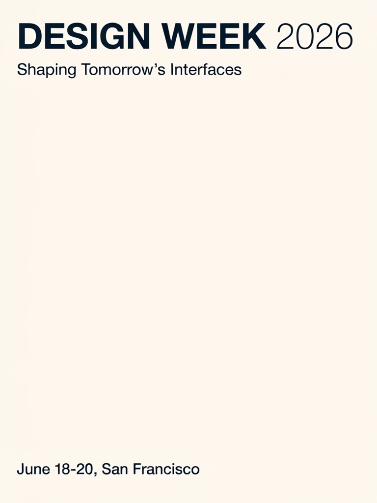
Round 1: The marketing poster
First up, the classic agency task: a typographic event poster with a headline, a subtitle, and a detail line. This is the heart of Ideogram's pitch, so I expected it to shine.
Parameters Ideogram 4.0: rendering_speed: QUALITY | image_size: portrait_4_3 | prompt_expansion: off // Nano Banana Pro: aspect_ratio: 3:4 | resolution: 2K
Ideogram 4.0
Nano Banana Pro

Same poster brief, two very different interpretations. Both nailed every word.
Text accuracy was a tie. Both models spelled the headline, the subtitle, and the date line perfectly, with clean kerning and a correct curly apostrophe in "Tomorrow's." That alone is worth noting, because eighteen months ago neither of these would have survived a three-line poster without a typo.
The difference was art direction. Ideogram played it minimal, almost austere: crisp navy type on a warm cream field with a lot of empty space. It reads like a well-set template waiting for a designer to drop in artwork. Nano Banana Pro took my "coral and deep navy" and "geometric layout" cues and actually built a poster, with bold Bauhaus-style shapes filling the lower two thirds. If I needed a finished poster from a single prompt, Nano did more of the design work. If I wanted a clean typographic base to build on, Ideogram's restraint is a feature, not a flaw. Round 1 is a draw on text, with a stylistic split on design.
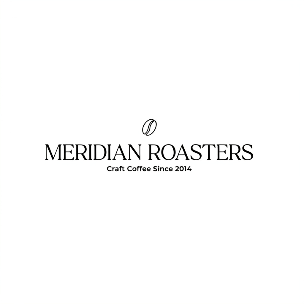
Round 2: The logo and wordmark
Logos are unforgiving. The text is short, but it has to be exact, balanced, and clean enough to actually use. I asked for a serif coffee-brand wordmark with a tagline and a small icon.
Parameters Ideogram 4.0: rendering_speed: QUALITY | image_size: square_hd | prompt_expansion: off // Nano Banana Pro: aspect_ratio: 1:1 | resolution: 2K
Ideogram 4.0
Nano Banana Pro
Both logos are genuinely usable. Spelling and tagline are correct on each.
This one was close to a dead heat, and both results are good enough to hand to a client. "MERIDIAN ROASTERS" and "Craft Coffee Since 2014" came out clean on both, with a tidy coffee-bean mark above the type. Ideogram set the wordmark wide and horizontal with a refined serif that has a bit more personality in the letterforms. Nano stacked it into a more symmetrical, centered lockup with a larger bean icon. I slightly preferred Nano's balance and Ideogram's typeface character, which is to say I would happily ship either. Round 2 is a tie.
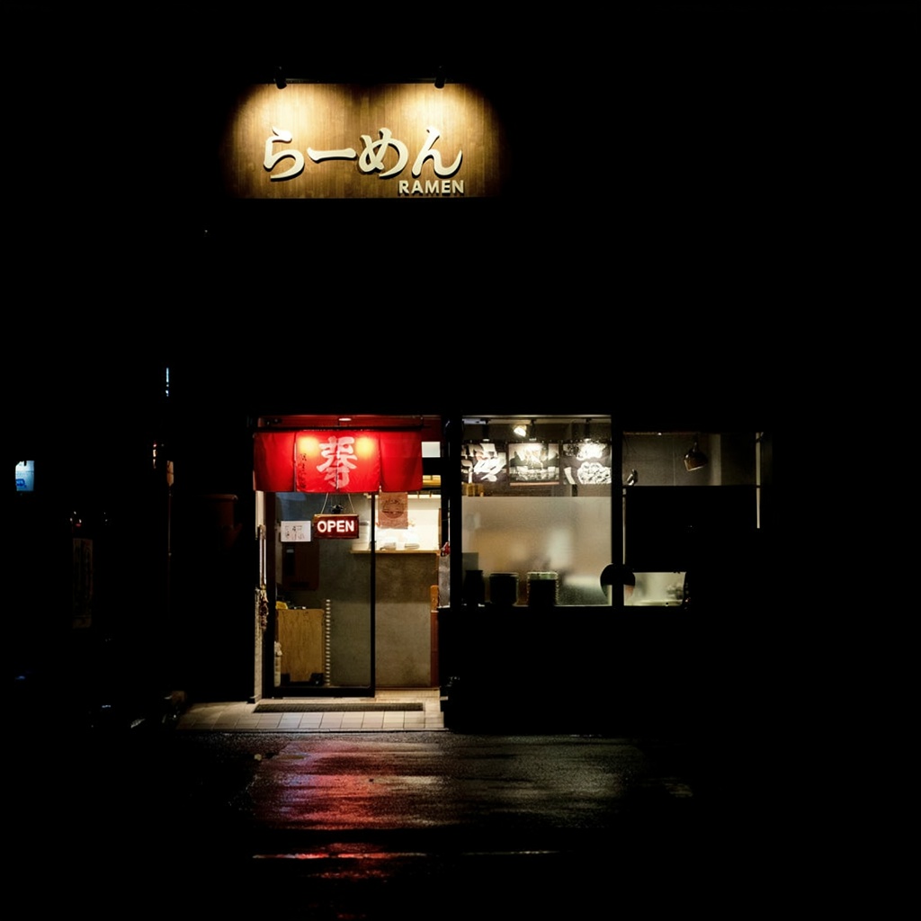
Round 3: Multilingual signage
Ideogram makes a specific claim about multilingual text, so I went straight at it: a photoreal ramen storefront at night with a Japanese sign and an English label. Non-Latin script is where a lot of models fall apart.
Parameters Ideogram 4.0: rendering_speed: QUALITY | image_size: square_hd | prompt_expansion: off // Nano Banana Pro: aspect_ratio: 1:1 | resolution: 2K
Ideogram 4.0
Nano Banana Pro
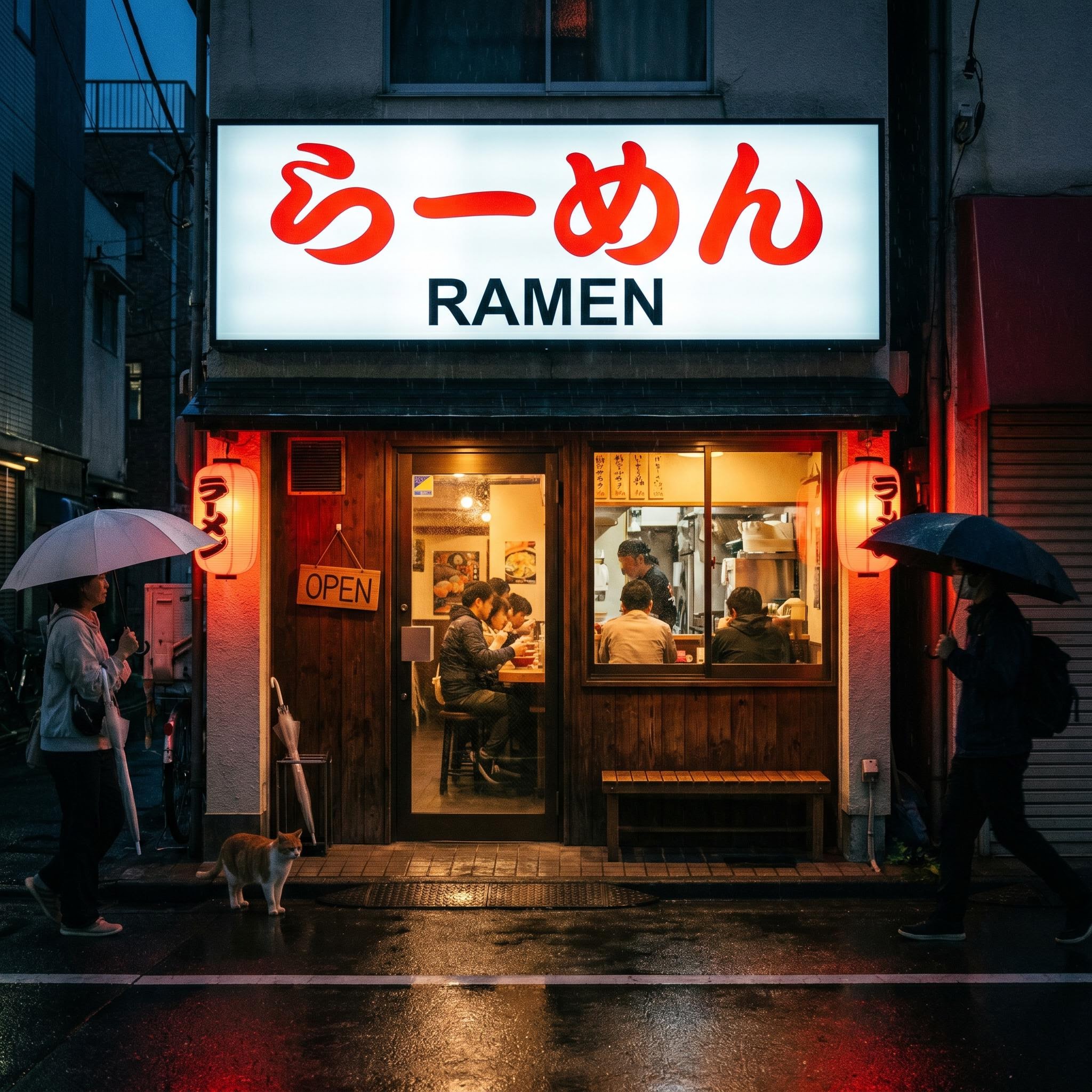
Both rendered らーめん, RAMEN, and OPEN correctly. The scene quality is where they split.
Here is the good news for Ideogram: the Japanese characters came out correct, the English "RAMEN" sat cleanly beneath them, and the "OPEN" sign was legible. The multilingual claim holds up. But this round exposed a pattern that repeated through my tests. Ideogram delivered a moody, atmospheric image that was also quite dark, with most of the frame falling into black around a brightly lit sign. Nano Banana Pro rendered the same correct text inside a fuller, better-exposed scene: red lanterns with their own tiny Japanese labels, customers eating inside, a cat on the wet pavement, pedestrians with umbrellas. Same text accuracy, noticeably more complete photograph. I would call text a tie and overall image quality a win for Nano.
Round 4: The complex infographic
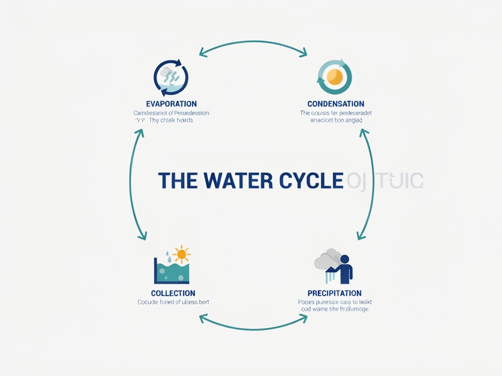
This is the round I most wanted to see, because Ideogram specifically claims strength in dense compositions with many elements. I asked for a labeled water-cycle diagram: a title, four stage labels, four one-line captions, icons, and connecting arrows. That is a lot of separate text objects in one frame.
Parameters Ideogram 4.0: rendering_speed: QUALITY | image_size: landscape_4_3 | prompt_expansion: off // Nano Banana Pro: aspect_ratio: 4:3 | resolution: 2K
Ideogram 4.0
Nano Banana Pro
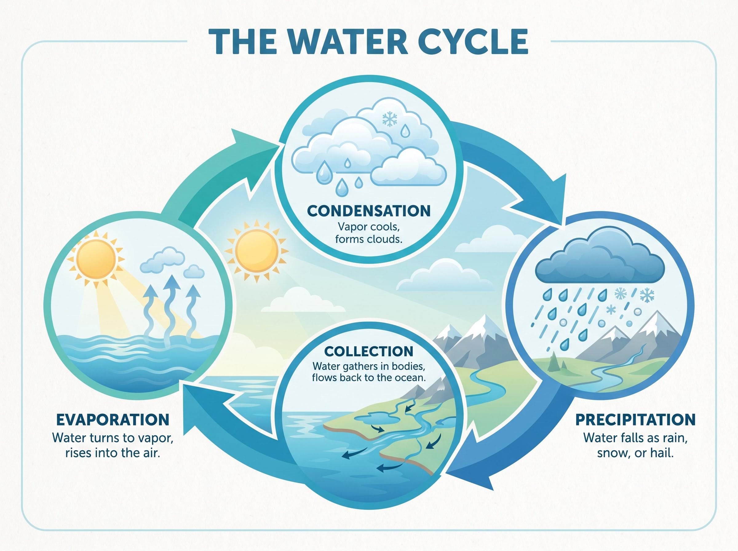
The decisive round. Ideogram nailed the labels but garbled the captions. Nano got everything.
This is where the gap showed. Ideogram got the title "THE WATER CYCLE" and all four stage labels spelled correctly, which is genuinely impressive for four separate headline words placed around a circle. But the smaller one-line captions under each label came out as gibberish, a soup of letter shapes that look like text from a distance and dissolve up close. There was also a faint ghost of stray characters floating next to the title. Nano Banana Pro, by contrast, rendered every caption as real, legible, accurate copy ("Vapor cools, forms clouds," "Water falls as rain, snow, or hail") inside a single cohesive illustration with consistent icons and a unified landscape. For anyone making educational content, explainer graphics, or anything with two tiers of text, this round is a clear Nano win, and it is the most important result in the whole test.
Round 5: Product packaging
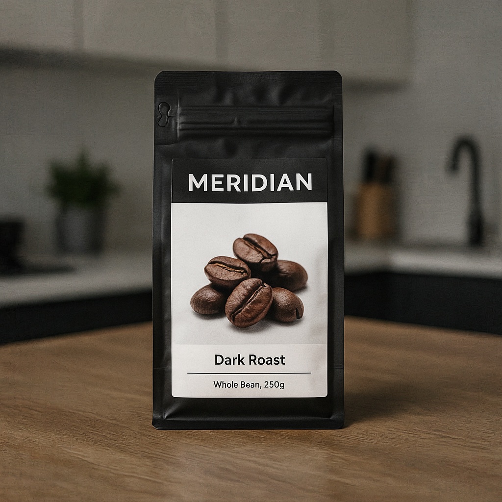
Last round, an e-commerce staple: a photoreal coffee bag mockup with a brand name, a variant, and small print. Three tiers of text on a real product in a real scene.
Parameters Ideogram 4.0: rendering_speed: QUALITY | image_size: square_hd | prompt_expansion: off // Nano Banana Pro: aspect_ratio: 1:1 | resolution: 2K
Ideogram 4.0
Nano Banana Pro
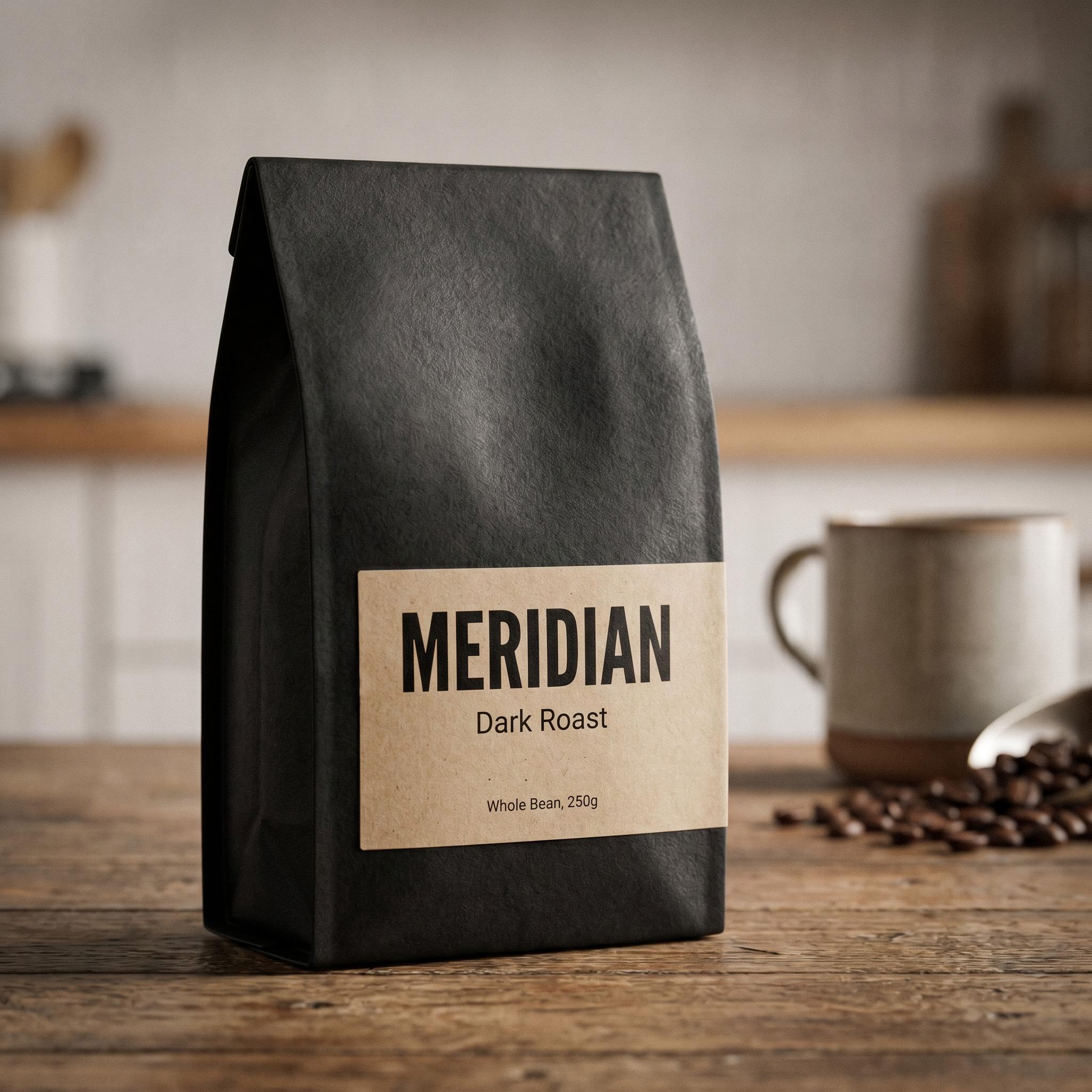
All three text tiers correct on both, including the small print. Both are ready to use.
Both models redeemed the small-text concern here. "MERIDIAN," "Dark Roast," and even the "Whole Bean, 250g" small print were sharp and correct on each. The lesson from rounds four and five together is that Ideogram handles small text fine when it is isolated and reasonably sized, like a line on a label, and struggles when many small captions compete in one dense layout. On styling, Ideogram gave me a clean studio mockup, while Nano added more of a lifestyle scene with a ceramic mug and scattered beans. Both are export-ready. Text is a tie, styling is a matter of taste.
One footnote from this round. My first packaging prompt used a kombucha bottle, and Ideogram 4.0 rejected it with a generic processing error while Nano accepted it without complaint. Swapping the product to coffee fixed it. Ideogram's content filtering is a little more trigger-happy than I expected on completely benign prompts, which is worth knowing if you automate at volume.
Where Ideogram 4.0 actually stands
Across five rounds, the scoreboard is closer than the launch claims suggest. On raw text accuracy, Ideogram 4.0 tied Nano Banana Pro in four rounds and lost the fifth, the dense infographic. It never beat the closed flagship outright on any single image. On overall finished quality, Nano produced the richer result in three of the five rounds. That is not a knock on Ideogram, which renders headline text, logos, and signage as well as anything I have used. It is a statement about how far the closed frontier has moved: the text-rendering moat Ideogram built its name on has largely been matched.
So why would you reach for Ideogram 4.0 today? Two reasons, and they are big ones. First, it is open weight under a commercial license, which means you can self-host it, run it in your own environment, and fine-tune it on your brand and product data. Nano Banana Pro cannot do that. Second, its output skews clean, restrained, and typographically disciplined, which is exactly what you want when the model is a base layer in a design pipeline rather than the final artist. If you are choosing a hosted API purely on quality, the gap has closed. If you need to own and shape the model, Ideogram 4.0 is in a category of one.
Honest assessment
What it does very well: headline and short-form text rendering that is essentially typo-free, accurate multilingual script, and clean, professional logo and signage output. The open-weight license and self-hosting story are genuine differentiators that no closed competitor can match right now.
Where it has room to improve: dense, multi-tier text degrades, as the infographic captions showed, and I saw an occasional stray ghost-text artifact. Compositions can drift minimal to the point of looking unfinished unless you art-direct them, and the content filter flagged a harmless prompt. None of these are dealbreakers, but they are real, and they explain why I would still keep a second model in my toolkit for busy, caption-heavy graphics.
Developer integration
Calling Ideogram 4.0 on Segmind is a single POST request. Here is the exact setup I used for these tests, minus the prompt:
import requests

response = requests.post(
    "https://api.segmind.com/v1/ideogram-4",
    headers={"x-api-key": "YOUR_API_KEY"},
    json={
        "prompt": "A poster with a bold title reading 'LAUNCH DAY'",
        "rendering_speed": "QUALITY",   # TURBO and BALANCED are cheaper
        "image_size": "portrait_4_3",
        "enable_prompt_expansion": False, # keep your exact text
        "output_format": "png"
    }
)

with open("output.png", "wb") as f:
    f.write(response.content)
The two parameters that matter most are rendering_speed, which trades cost for fidelity, and enable_prompt_expansion. Turn expansion off whenever your in-image text must stay exactly as written, because the expansion step can quietly recase or reword it. Full parameters and pricing live on the Ideogram 4.0 model page.
FAQ
What is Ideogram 4.0 best at? Rendering accurate text inside images: headlines, logos, posters, signage, and product labels, including multilingual text.
Is Ideogram 4.0 better than Nano Banana Pro? For short-form text they are roughly tied. Nano Banana Pro edged ahead on dense captions and overall scene richness in my tests, while Ideogram wins on being open weight and self-hostable.
Does Ideogram 4.0 handle non-English text? Yes. It rendered Japanese script correctly alongside English in my signage test, and multilingual support is one of its stronger areas.
Why did my Ideogram 4.0 text come out misspelled? Usually it is prompt expansion rewording your copy, or too many small captions competing in one layout. Turn expansion off and keep text strings short and well spaced.
How do I call the Ideogram 4.0 API? Send a POST request to the endpoint with your API key and a prompt. See the Python snippet above or the model page.
Can Ideogram 4.0 make infographics? It handles titles and large labels well, but dense one-line captions can degrade. For caption-heavy diagrams, plan to clean up or pick a model that holds small text better.
The bottom line
Ideogram 4.0 lives up to its text-rendering reputation on the jobs that made that reputation: posters, logos, and signage came out clean and accurate, matching the best closed model I tested. Where it slips is dense, caption-heavy layouts, and it no longer has a clear quality lead over Nano Banana Pro. Its real edge in mid-2026 is being the best open-weight model you can host and fine-tune yourself. If that matters to you, it is an easy yes. Try Ideogram 4.0 on Segmind and run your own prompts: segmind.com/models/ideogram-4.